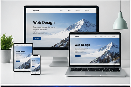
Responsive design means that a website automatically adjusts to different screen sizes, such as mobile phones, tablets, and desktops.
Today, most users browse websites on their phones, so responsive design is essential.
Developers use flexible layouts, media queries, and relative units like percentages instead of fixed sizes.
A well-designed responsive website improves user experience and increases engagement. If a site is hard to use on mobile, visitors will leave quickly.
That’s why every modern website must be fully responsive.